Fresh New Look for Chopin
2021-03-10 • 3 min read

We’ve been working hard on the new Chopin web app. The updated app helps your customers to find products more easily and resume their unfinished shopping trips seamlessly.
In addition to a fresh UI, we’re bringing you the following major updates:
New UI, Better Navigation 
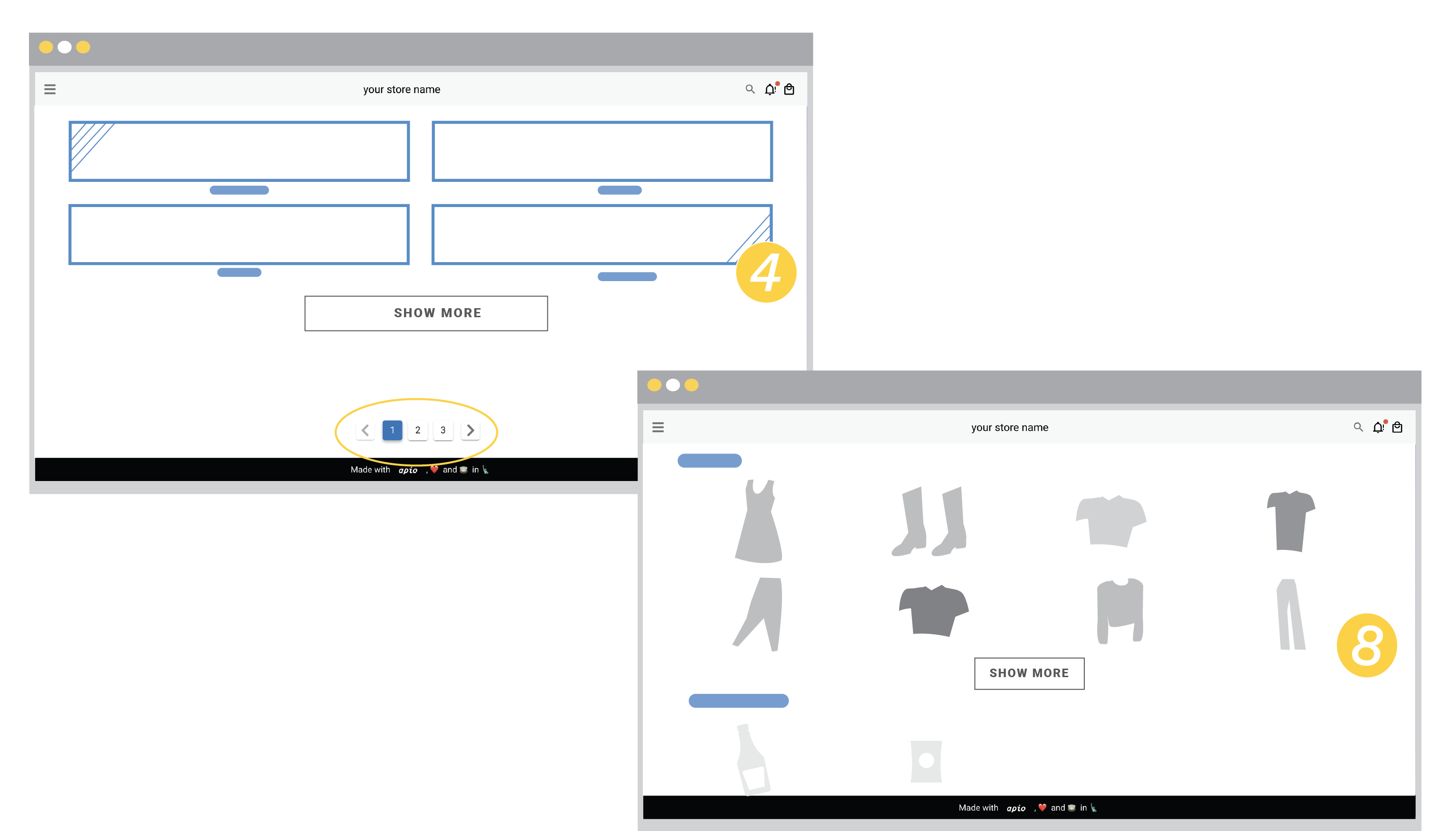
We’ve introduced category tiles to give the shoppers a quick overview about what you’re selling. You can still jump to certain category through the navigation menu (). As part of the new design, you will notice we now only display up to eight products per categoy on store’s main page, plus pagination. These updates can avoid overwhelming shoppers while providing necessary information to spark their interests at a glance.
We also present a separate store description section making more rooms for content about your brand. The new store information can be accessed by swiping the hero image.

Cached Shopping Cart 
Great news! Chopin stores now officially have shopping cart that remembers shopping history using cookie. When you add products to your cart, Chopin saves the data, as you browse the store and close the browser your shopping cart products stay with you.
Sometimes customers leave the store page before completing transaction (70% of shoppers abandon carts at checkout). They might not be ready to purchase anything, were just looking, or wanted to compare pricing. We’d like to help you covert these shoppers by helping them pick up where they left off seamlessly.

Search Product Easily 
We’ve added a search bar to the new UI. This will help customers find the right products. Shoppers can now enter keyword on the search bar and see a list of products containing those words either in product name (product id), nickname, or description. Letting shoppers find their desired products fasters will lead to better user experience and potentially higher conversion rate.
We encourage you to refine your product description with more meaningful keywords to help visitors navigate your selections. The search function only works for Latin/Roman scripts (i.e. English, Spanish, French, etc.) for now and will be available to all languages soon.
Styling with Markdown 
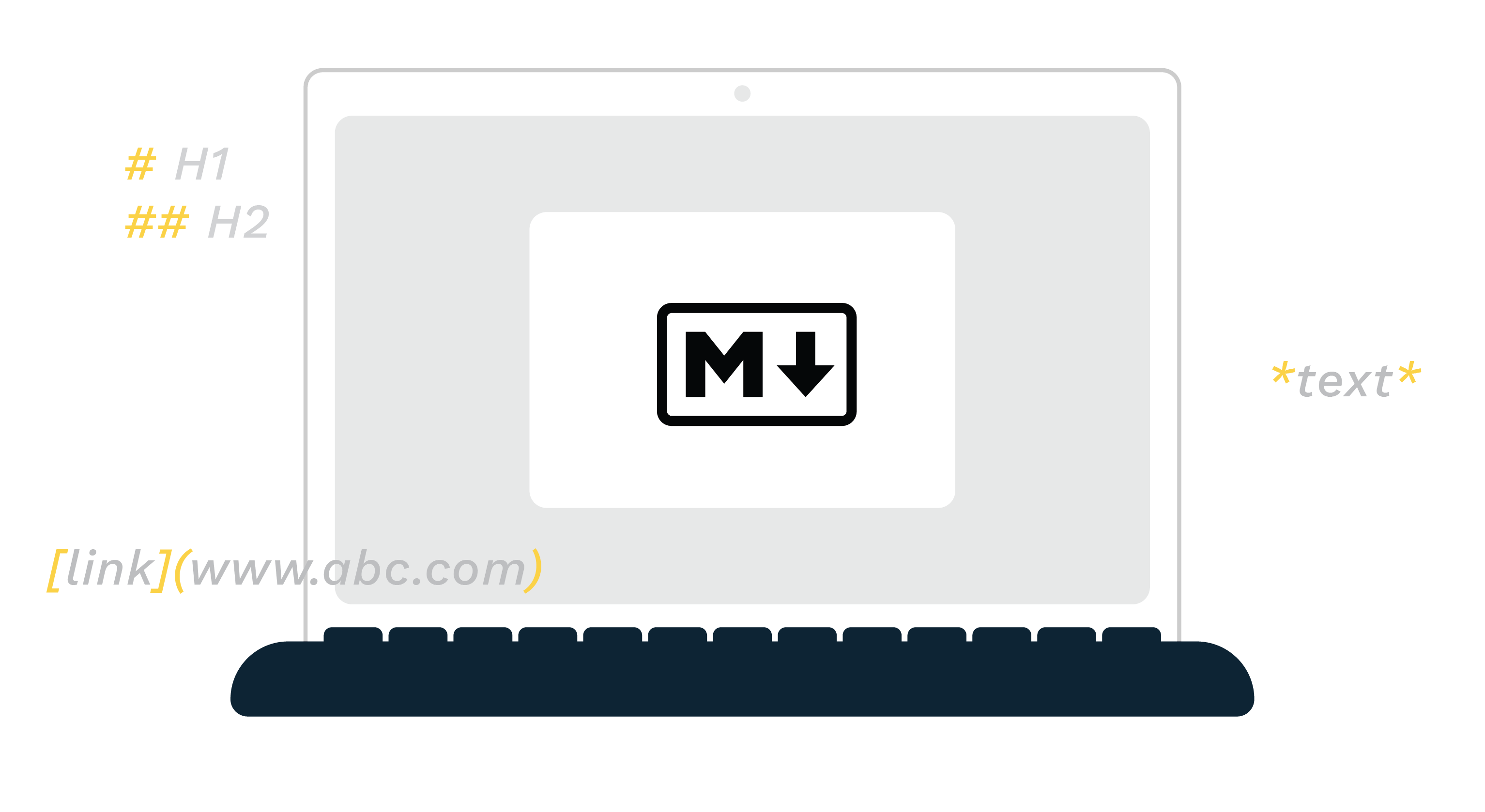
We’re introducing text styling with Markdown for store information and product description. Markdown makes writing on the web fast and easy. You can now write bold and/or italic for emphasis. You can also control the font size and organize sentences into lists. Linking key phrases to your social media posts is doable as well.
See Markdown cheat sheet for more styling inspirations.

Feedback 
We always prioritize the user experience for the shoppers (aka your customers) and work closely with our designers and analysts on improvement. We hope you’ll find the updated design and new features helpful. Feel free to send us your input or suggestions. We’d love to hear from you!
Painless Transition for Current Users 
The updated design has been rolled out this week. For our current users, there’s nothing you need to do - we’ve already connected your catalog and order Google Sheets to the new UI. You can now access the updated URL through Chopin app on Telescope or the email communication we’ve sent out this week.
Coming Soon: Virtual Products, Events, and Calendar 
We’ll be releasing features that support virtual products and events, such as online courses, downloadable prints, and digital assets in the near future. Some of the great improvements will allow you to send out meeting or download links followed by confirmation emails and to select dates at product page. Join our mailing list and we will keep you posted!
Happy Chopin! 🛒